


Branding a university: The story of UK’s marketing materials
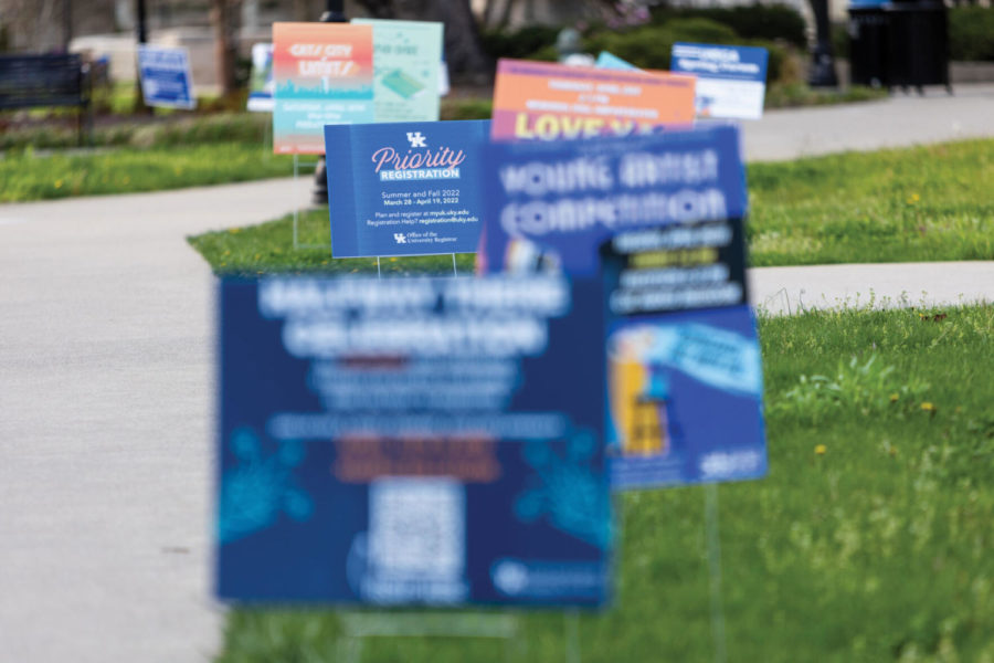
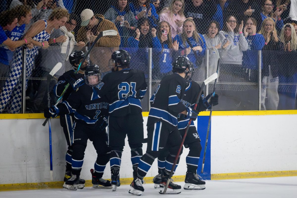
Yard signs line a sidewalk outside White Hall Classroom Building on Wednesday, April 13, 2022, in Lexington, Kentucky. Photo by Jack Weaver | Staff
April 14, 2022
Whether they are promoting vaccine incentives, student events or the university to prospective students, promotional materials are omnipresent on UK’s campus. Designing, printing and distributing these advertisements is a multi-step process taken on by a plethora of UK offices under several sets of standards.
Julie Balog, UK’s chief marketing officer, oversees UK’s branding. She works with the Enrollment Management and Student Success offices to produce UK marketing materials, ranging from recruitment materials sent to prospective students to promotional banners attached to light poles around campus.
“When we develop these things, we put it through the lens of the brand standards,” Balog said. “We know what our brand is, we know what we stand for. And so we really try to bring it to life through those types of activations.”
In 2019, UK changed its brand slogan from “see blue” to “Wildly Possible.” With the brand redesign came a new set of graphic standards. The 160-page brand manual, which is available to download for anyone with a linkblue ID, contains specific guidelines on the phrases, fonts and colors that should be used on UK promotional materials. UK chose these fonts and colors after surveying focus groups. Balog said that after constructing “mood boards” with different photography styles and color palettes, UK showed them to students, staff and alumni, asking which styles were most appealing.
The graphic standards booklet contains four primary fonts: Avenir, Surveyor, Trade Gothic and Blackbike Rough. Mercury can also be found in promotional materials, usually in logo lockups. The booklet also contains several color palettes: a neutral palette with various shades of gray, a primary palette that features the iconic Wildcat Blue and a secondary palette, containing emphasis colors like a light blue called Bluegrass, a yellow called Goldenrod and a pale orange called Sunset.
“Prior to this iteration of Wildly Possible, there weren’t secondary colors that were available. It was blue, white or gray, and you could have shades of blue, white or gray, but there wasn’t a lot of secondary colors,” Balog said. “That was a process where we got a lot of feedback.”
Laura Reese, a junior computer science and math major, said she appreciates the rebranding.
“It does feel a little cheesy, but it definitely does have a much more positive connotation,” she said. “You’re coming to UK, you’re actually doing something, you’re really learning how to do it … as opposed to just like, ‘see blue’ and school spirit. I think that, in terms of rebranding, [it] probably was the way to go.”
Online branding mostly follows the same standards as print materials, with the exception of some fonts. Since Avenir and Surveyor are not available on all platforms, UK offers Arial, Georgia, Lora and Muli as open source alternatives for web design.
Once materials are designed, they are sent to a vendor on UK’s approved vendor list for printing. UK has used an RFP process, in which vendors send proposals to UK to be approved or declined, presenting their skills and how they can support production, to pinpoint vendor specialties.
“If you need something embroidered with a logo, let’s look at these two or three [vendors]. If you’re needing signage, look at these two or three,” Balog said. “So we ask people to just go to the purchasing website, look at who those vendors are, and then use one of those approved vendors for our process. That’s what we do, and then that’s what we ask people around.”
In regard to the future of the brand, Balog is looking to expand it, creating more templates for departments outside of UK Marketing to develop promotional materials that still align with the unified brand standards.
“I look across the campus, and I see a lot of ways in which the execution of this is going really, really well,” she said. “One of the things you want from a brand is you want to be able to look at it and recognize it … and that’s not just in the design part. It’s in the photography; it’s also in the the way you write headlines or the way you write your copy. And so when I look around, I see a lot of really good work that’s happening all around campus.”
Balog said she’s not involved with the process of designing and distributing promotions for student-led events, though.
That responsibility falls to UK’s Student Activities Board, which has a team of student designers producing signs and posters. One of these designers is Maddie Gatewood, a junior biology major and a co-director of graphic design at SAB. Gatewood’s design process can begin a semester before an event is even scheduled to happen, as SAB events are approved and scheduled.
“The board has a specific way of getting events set in stone, and we usually propose them a semester out. We have a list of all the events for this semester,” she explained. “We have a specific due date that’s about two weeks outside of when the actual event is supposed to happen. We usually try to get them in as early as possible, because there are different levels of approval that the graphic has to get.”
Gatewood said that SAB collaborates with directors of events, usually associated with the Student Organizations and Activities, on what they want designs to look like, but with the exception of not being allowed to use some university symbols or mascots, they do not have to abide by strict graphic standards like UK Marketing does.
“We can’t use any UK specific logo, so like Bowman is difficult because all of that is controlled by the university. And even though we’re a university organization, we’re not allowed to promote on the behalf of the university. So it makes things a little bit difficult to use. I’ve made stickers before with Bowman on them, and we’re not allowed to use them because the university won’t approve them because that’s a university standard,” she said. “But other than that, we don’t really have any restrictions.”
Gatewood uses this opportunity to get creative with her designs – a welcome relief from her normal curriculum.
“It gives me a nice little break from my classwork, which is majority STEM-based,” she said. “It’s really fun to look at the draws of the event and what it’s about and then use that as a kind of basis to make the graphic.”
When designing graphics, Gatewood ensures that they are accessible and appeal to the widest audience possible. She described making sure fonts are large and legible enough so that people with varying levels of vision can read them, as well as monitoring drawings to make sure they depict a diverse range of people.
She specifically recalled her experience designing promotions for the SAB Splash Bash, which took place on Saturday, March 26. When designing the graphic, which featured a group of people in inner tubes, the vice president for promotions at the time informed her that she had only featured white individuals in her design and recommended she add more diversity.
“I was like, ‘Oh my gosh, of course I didn’t even think about it.’ Because when you’re making graphics, sometimes you don’t really notice that kind of stuff,” she said.
Gatewood proceeded to add designs of more gender-neutral people and people of different ethnicities to ensure that the final product featured “a multitude of different individuals.”
“I’ve been a lot more cognizant of that because that happened two years ago when I first started in this position,” Gatewood said. “Since then, I’ve made a point to make sure that the images I’m using are inclusive, and if they’re not, making sure that there’s a way I can make them inclusive.”
Senior language economics major Andrew Butkovich is SAB’s vice president for promotions. While Gatewood and other designers are in charge of making the promotions themselves, Butkovich and the other SAB executives approve, print and distribute the designs.
The design, social media and information-gathering process for promotional campaigns is mostly contained to UK; for example, Gatewood designs materials with Adobe Illustrator through her UK-linked Adobe account.
“A big advantage in this that has to do with just going to an institution like UK is that we have a lot of resources available to us through the university,” she said. “UK pays for the Adobe suite for all students, and you can just get it through using your linkblue. That has been super helpful for me because if I didn’t have that I would have to pay for it on my own.”
When it comes to actually printing signs, however, UK works with the printing companies Ricoh and Monster Color. Butkovich described these relationships as “very, very nice,” with both companies being “super responsive.”
Butkovich said that SAB prioritizes posters and yard signs for its events, putting the promotions in high-traffic areas like the William T. Young Library, the White Hall Classroom Building and the Gatton College of Business. For larger events, SAB will also create handbills to distribute to students. Event announcements are also posted on SAB’s social media, and the “availability and accessibility” of these multiple channels is something that Butkovich appreciates. However, He also recognizes the detriments of in-person advertising, especially with virtual learning still being prevalent.
“People don’t see that stuff all the time, and I’ve talked to people who are like, ‘Oh, I didn’t know that that was happening.’ Sometimes especially, [with] COVID, people aren’t walking on campus as much, and then if they don’t follow us on Instagram or go to a website, they don’t see that stuff,” he said.
Reese, who gets most of her information about SGA events from campus signage, had this same issue.
“Last year, when I wasn’t walking around as much, I didn’t have as much contact, or I didn’t see them as often, so I didn’t know many other SGA events,” she said. “My roommates were involved, and they did go to a couple of SGA events last year, so I knew about them through word of mouth. But aside from that, there’s not any other place that I really see them.”
Reese said she finds the signs convenient and accessible.
“They’re just in a really centralized location on campus,” she said. “They’re bright, they’re colorful. I think they’re well designed. They very clearly have the date and the time, and you really quickly, just by looking at the poster, get an understanding of what the event’s going to be.”