


UK Athletics unveils new “UK” logo
April 30, 2015
Old logo
New logo
By Kevin Erpenbeck
It’s no secret that the campus of UK is getting a major face-lift in the next few years.
New dorms are popping up in different locations seemingly every semester. The Student Center is getting torn down, only to be built anew in the same spot. Commonwealth Stadium will look much different by UK Football’s season opener in August.
But the university’s most recent change isn’t quite as noticeable as the others.
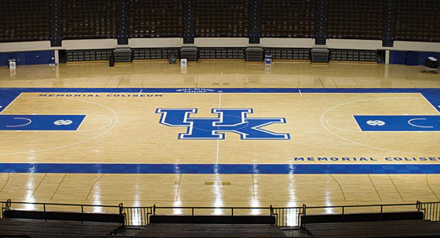
The recognizable “UK” logo that is used for all of the program’s athletic teams got a subtle nip and tuck to go along with the major changes around campus. UK Athletics revealed the new logo to the public on Wednesday with a shared Twitter photo of a remodeled Memorial Coliseum hardwood floor.
“After more than a year of research, feedback and work, we determined it was time to refresh our primary mark,” Executive Associate Athletics Director Jason Schlafer said.
The change to Memorial Coliseum’s floor was due to a water leak in the building, according to Schlafer. The hardwood surface now features a checkerboard-designed blue boundary line around the court, a different SEC logo in the paint, and of course, the new “UK” logo in the middle of the floor.
The new logo will also be displayed in the turf of Commonwealth Stadium when renovations are completed next semester.
Nike, UK’s main athletic-apparel partner company, worked with the program over the last year remodeling the 18-year-old logo into a fresh, slicker version.
But Schlafer is hesitant to calling the new logo a “change.” Instead, he prefers to say that it has evolved.
“It’s not a dramatic change,” Schlafer said. “We wanted to find a way to highlight the ‘K’ while continuing to communicate the ‘We are UK’ message. It’s more of an evolution than a change.”
The changes include removing a triangle mark between the “U” and the “K,” bringing the two letters closer together. The base of the “K” was also slightly changed to make it stand out more prominently than before.
As far as the logo appearing on future university apparel, Schlafer said the sports that begin their seasons in the spring of 2016 will feature the new design on their respective jerseys, as will the fan merchandise of said sports. By the fall of 2016, all UK student-athletes will be given apparel that display the updated logo, and the retail products will soon follow.
It is currently unknown if the new logo will be displayed in the court of Rupp Arena anytime soon.
Schlafer said that the new design serves a purpose in previewing what is to come for the university while also highlighting the storied past.
“Our goal was to update,” Schlafer said. “It helps us keep up with and represent the future, but also represents our very strong recent past.”